A couple of recent releases have prompted me to spend a little time trying a new style for my IDE.
Specifically:
- The Tomorrow Theme (and associated Hacker News thread)
- Adobe Source Code Pro font (and associated Hacker News thread)
The Tomorrow Theme

The Tomorrow Theme is a colour palette (actually series of colour palettes) from Chris Kempson that emerged out of 5 years of personal use and revision.
I’ve chosen to go with the Tomorrow Night palette:

For my use in Visual Studio I downloaded and begun adapting the Tomorrow Night Visual Studio Theme from Chris’s GitHib repository.
I think the VS theme can use some work, but the palette itself is pretty cool and any issues are to be expected as this wasn’t designed for Visual Studio.
You can download the theme as a compressed repository from GitHub.
Adobe Source Code Pro
![]()
Source Code Pro is a new font designed by Paul D. Hunt, a typeface designer and developer at Adobe.

It’s the eagerly awaited monospace companion to the recently released Source Sans Pro.
You can download the font from SourceForge or grab the source/unbuilt files on GitHub.
The Outcome So Far
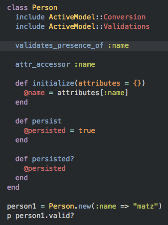
After putting these two together this is what I have so far:


So far I’m liking the new theme, but it’s still very much a work in progress and I’m already spotting things I want to change:
- Consider a bolding font weight as per the Tomorrow Night TextMate sample.
- Distinguish between keywords (e.g.
class,public) and type aliases (e.g. lowercasestringandobject). This will probably required a plugin such as ReSharper’s enhanced Syntax Highlighting - Distinguish between objects/methods/properties
- Revise the highlighting in more advanced cases (e.g. selection, debugging, breakpoints)
- Extend the colouring consistency throughout the UI (e.g. already had to change the line number colouring to be consistent just so I wouldn’t go crazy)
- Review Razor, HTML, and JavaScript colouring
- Check out Base16 colours (described as the “next evolution of Tomorrow Theme”)
In the meantime I’m keen to hear feedback and see what everyone else is using.
